Malgudi
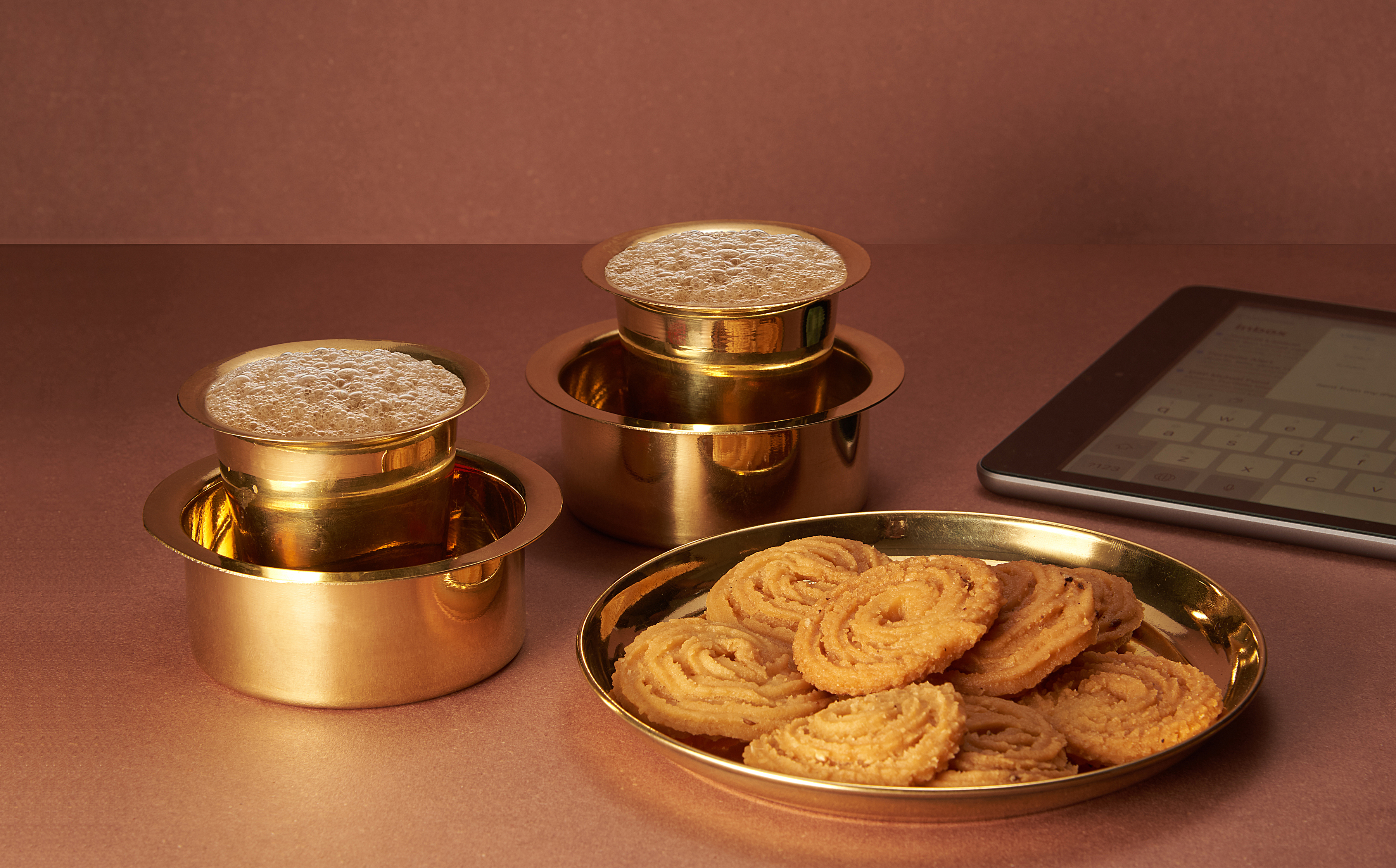
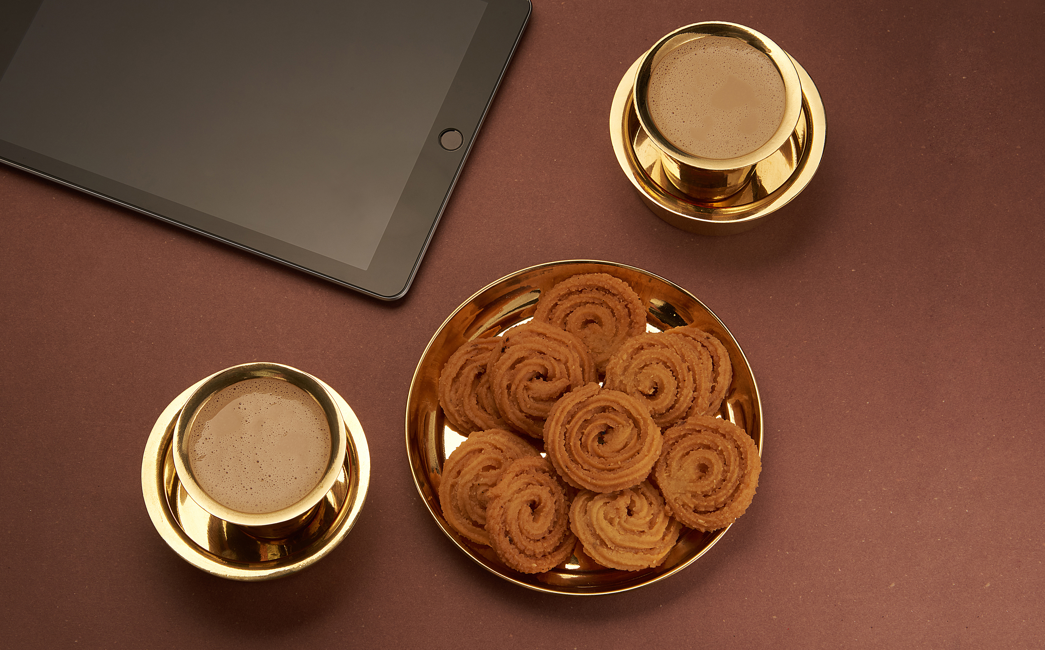
While coffee culture is a relatively new category, filter coffee as a product has been a South Indian mainstay for centuries. There are nuances to the filter coffee product just as there are nuances to the various sub-markets of South India, namely AP + Telangana, Karnataka, TN, and Kerala.
Traditionally filter coffee was purchased from a coffee roaster, who would roast it fresh and then grind a batch just for you. Though not identical, one could compare it to the atta chakki method of buying flour. Depending on how strong you like your coffee, you ask for a specific ratio of coffee to chicory - Chicory is a filler-like additive that gives traditional filter coffee that full bodied roundedness. The typical range is anywhere from 60% coffee to 80% coffee. In fact some people may even use the term 60 degree or 80 degree coffee, and that’s just a colloquialism for the same buying habit.
One of the toughest challenges working on this project was working our way
around a similar but
highly nuanced, multi-lingual market.
We sat through several groups, met tens of consumers as
part of research,
to get a better grasp of likes, preferences, motivators, and such.
Brand Strategy
Over the last 40 years, local roasteries grew into small brands and became regional players of roast and ground coffee, the trade term for packaged filter coffee. Today in the South, there is just one national brand of roast and ground, and that is Bru, the rest are regional brands. This is the opportunity that the CCL leadership spotted, and that is how brand Malgudi was born.
One of the toughest challenges working on this project was working our way around a similar but highly nuanced, multi-lingual market. We sat through several groups, met tens of consumers as part of research, to get a better grasp of likes, preferences, motivators, and such. Along with the client team we tested several communication planks that would sit readily with the name and not just be believeable, but also be liked by millennial homemakers.
Malgudi was the winning name, given how well it conjured up thoughts of something traditional, something old-fashioned, something trustworthy and most importantly, something pan-South Indian. The sentimental driver, was this woman’s longing for something that is dependable and at the same time trendy or “attractive” - to quote a highly-cited research term. The rational driver, was this woman’s need for a go-to coffee for her me-time moment at the end of her morning rush hour.
TVC produced by Janrise.
Now that we had a few insights into their minds,
it was easy to craft a design brief. Our design brief
was a simple one liner
- Combine South Indian and contemporary in a trustworthy manner.
Packaging design
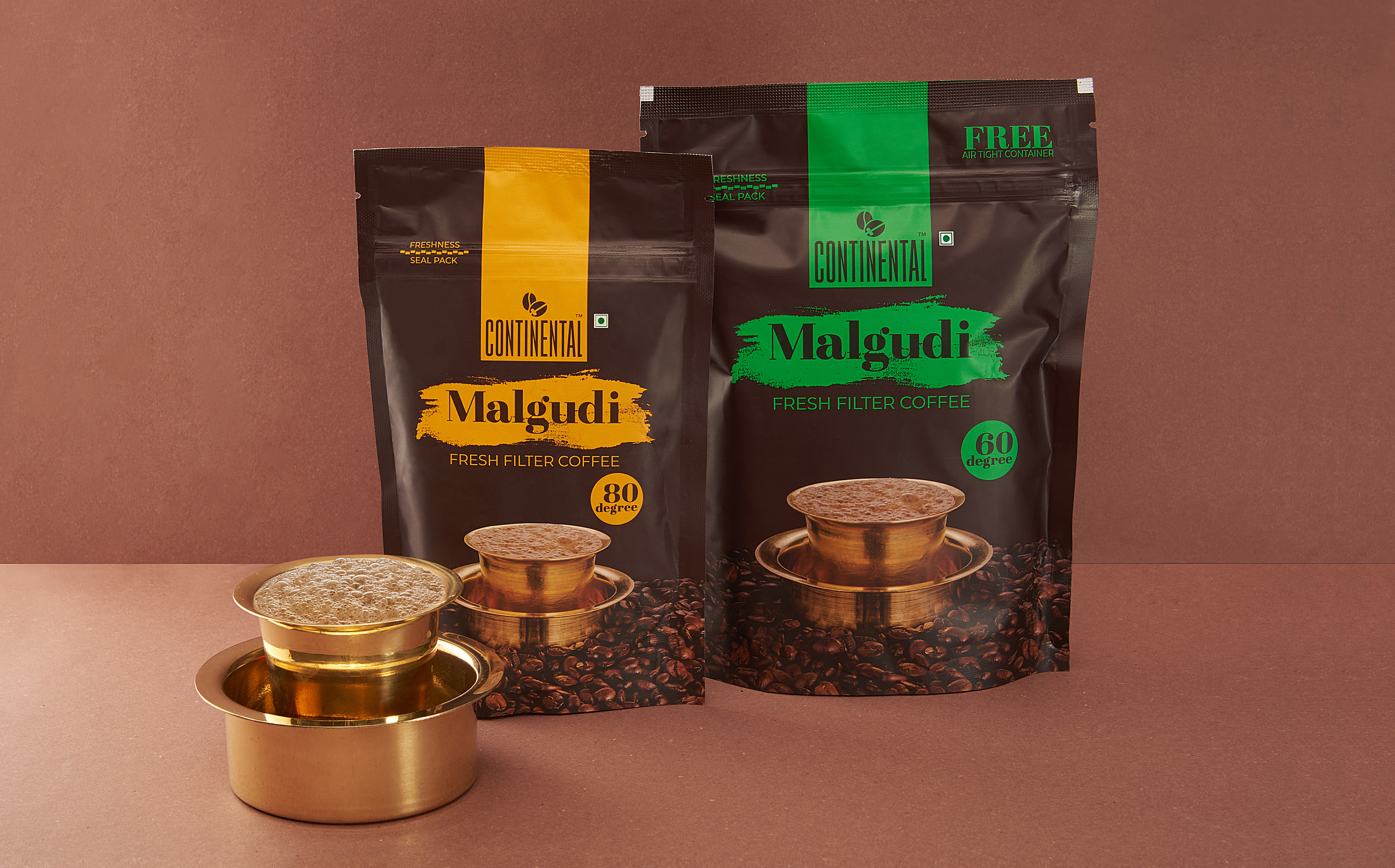
Once we had our name, we went back to identitfying the design code that would be preferred by this target group. Now that we had a few insights into their minds, it was easy to craft a design brief. Our design brief was a simple one liner - Combine South Indian and contemporary in a trustworthy manner.
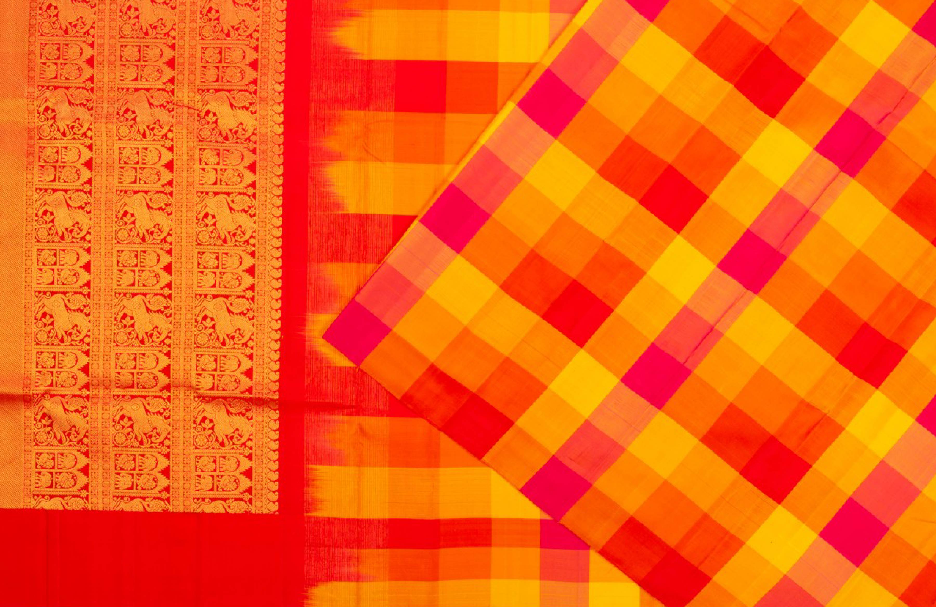
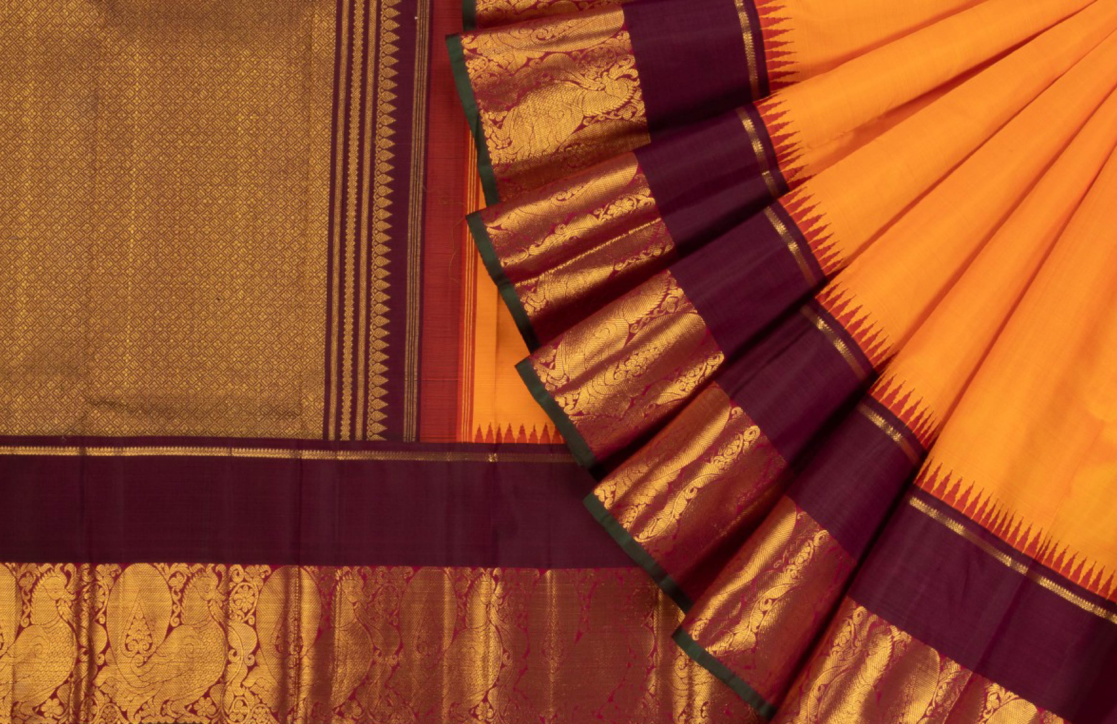
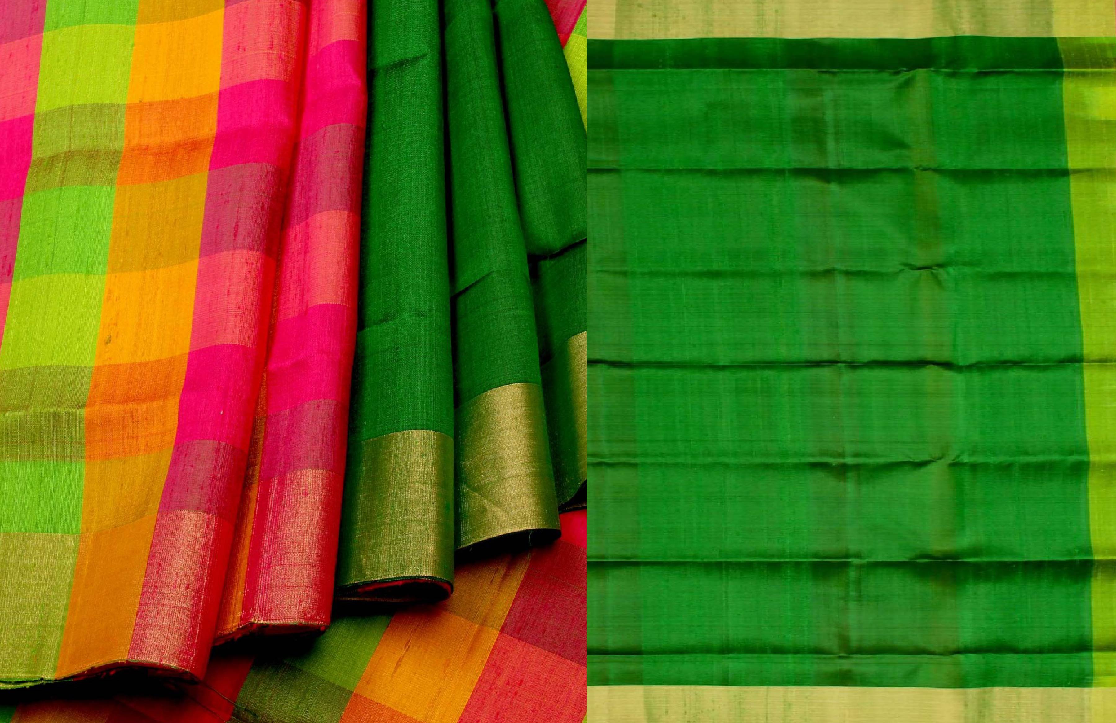
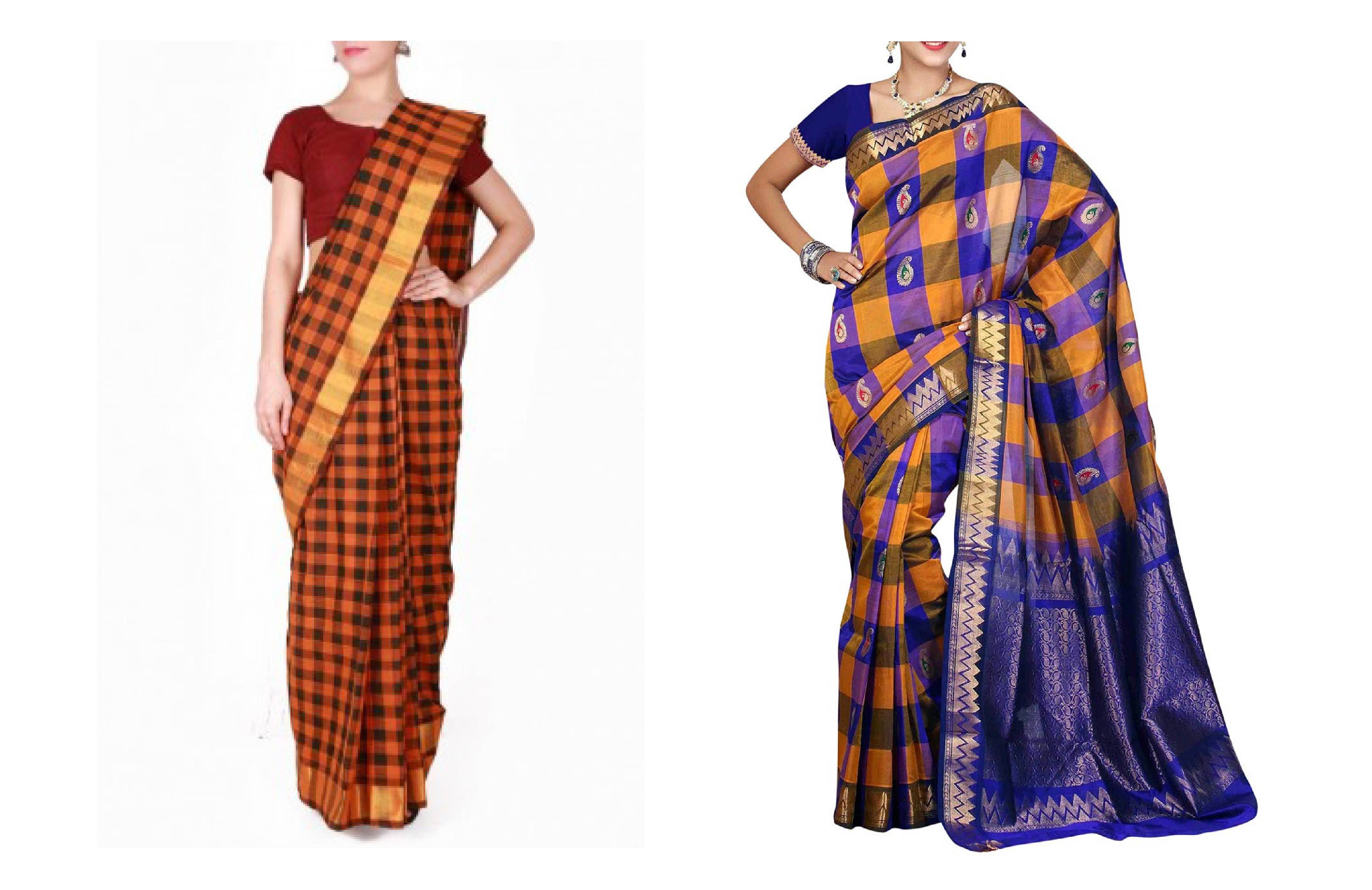
From this point on, we focussed all our efforts on getting the right mix of typography, graphic design, illustration and use of colours to allude to the values we had set as a target. For the Brand logo we worked with a serif that would instantly resonate dependability, but also gave it a casual brush stroke to offset the seriousness. Further we used colour to play up Brand Malgudi’s strengths - We chose a colour palette inspired by bold traditional solid colour-blocking often found in cotton saree combinations.
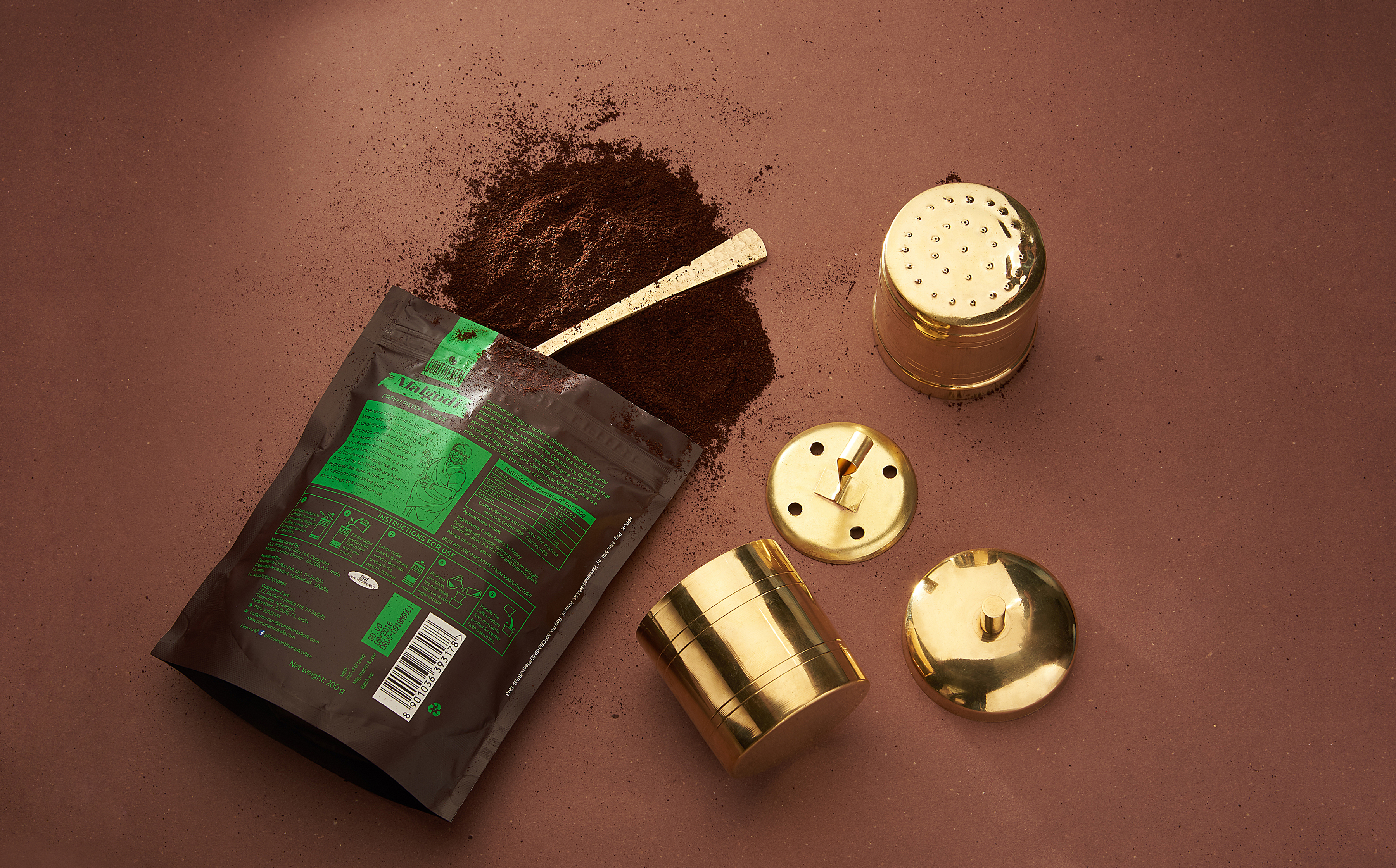
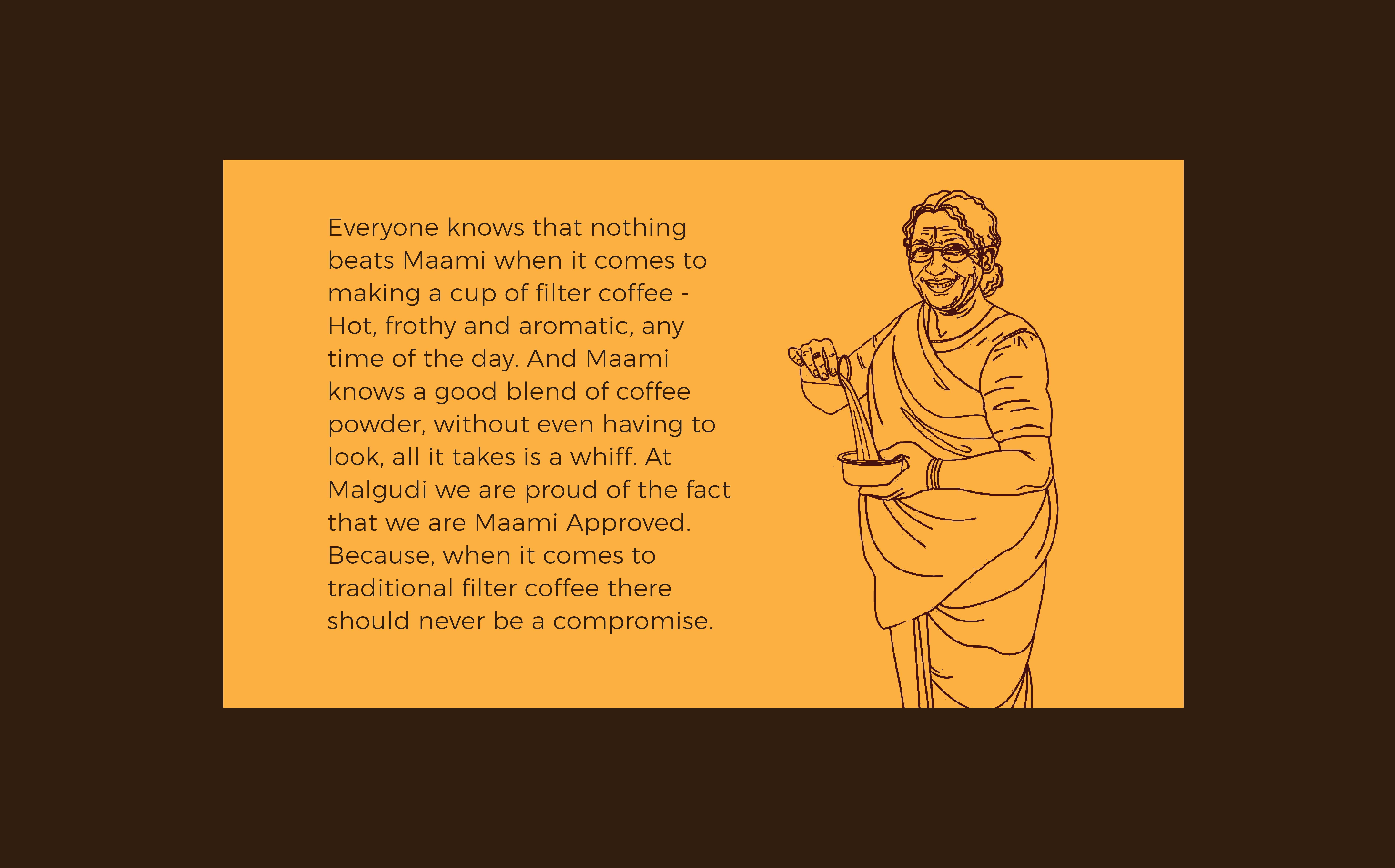
Lastly, as back of pack, we completed the story with a friendly mascot in the shape of a traditional maami who acts as the ultimate testimonial for matters of the home. We illustrated this character in the same monotone so as to keep the visual grammar as lean as possible. This minimalism was the key to finally summing up the blend of traditional South Indian and contemporary design.
office
4th Floor, Shram Dham, 19 Road, Khar West, Mumbai 400052
B11, 67 B Ballygunge Circular Road, Kolkata 700019